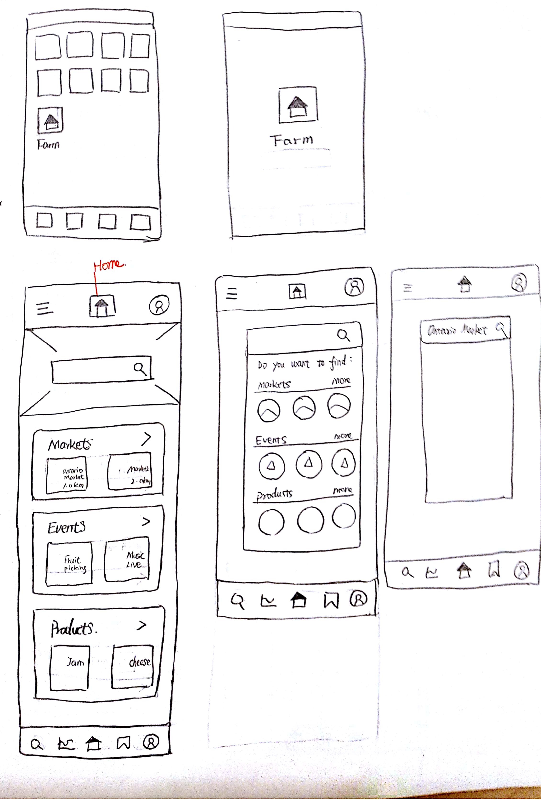
Farm App

chevronLeft icon Previous Project Next Project chevronRight icon

I conducted the Farm App project from the scratch. The method includes Business Analysis, PACT analysis, site map, user flow, paper sketch, low fidelity to high fidelity wireframes, logo design, style tile, visual design, and the final functional mockup.

Functional Prototype

Click the prototype to try the farm app!

Background

Farm market industry is an essential part to the Canadian economy. Farm operators are using direct marketing to grow their business and sell products directly to consumers. According to the statistic from Canadian Census of Agriculture, only 3.8% farm operations choose the digital methods to attract customers.

Goal

In the design group, we decided to take a deep look in the farm market by using various of methologies. Our initial intention is what to figure out why there are rarely people use digital products to boost their market.

Brainstorm

Farm market is targeted for 2 groups of people: the customers who want to buy farm prodcuts, and the vendors who sell farm products in the market. Our design team use a role play method to immerge ourself as the users. We were separated into two different groups, one is for the vendors, and another is for the buyers. My role was an elder person who visits the farm market (left picture).

By using this unique way, I deeply understand the needs and goals from both customer's side and vendor's side. We gathered all the experience and information we had, and wrote the important points on the white board.

Persona

I did a simple persona for the target user after this activity.

PACT Analysis

This PACT analysis, which stands for People, Activities, Contexts, Technologies, is a human-centered design framework that help designers to think about a design situation.

I analyzed the people in the market based on the PACT framework.

Open Doc

Here is the draft version:

Business Analysis

I analyzed 2 apps that related to farm market. The evaluation is from 4 perspective: information architecture, visual design, usability and content.

Open Doc

Problem

According to the research, I noticed that there are some problems in the existing app:

1. The app is hard to use, user could't find the information they need.

2. After user download the app, it asks them to log in or sign up before using it, which is annoying.

3. Too much information squish together on the screen, it's hard to read.

Solution

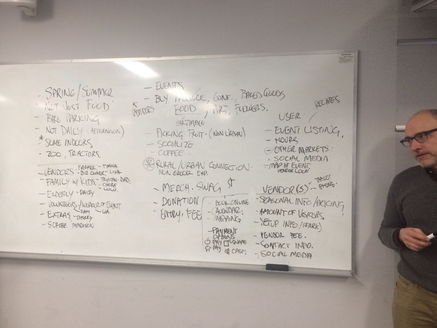
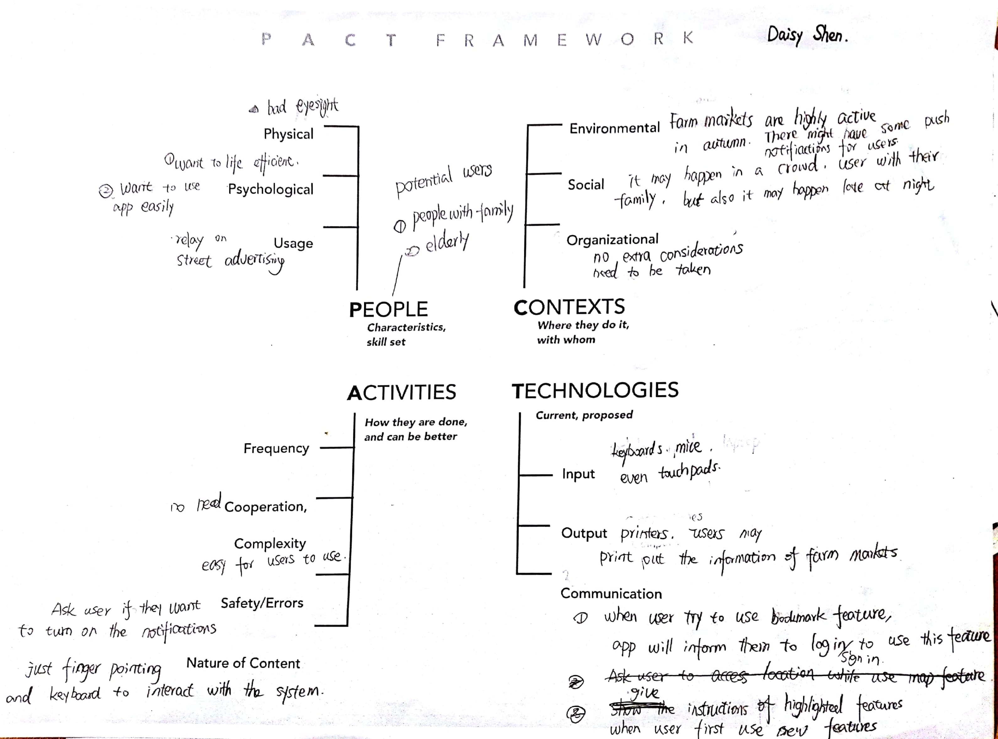
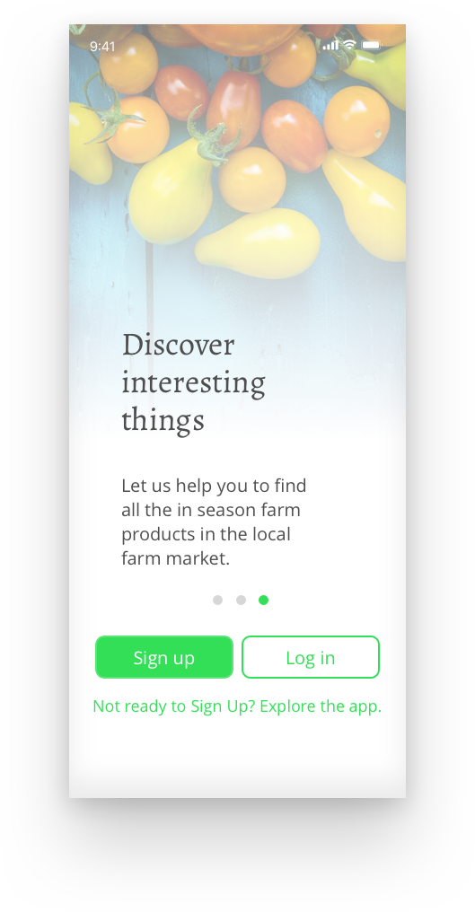
The target user is not the tech-savvy teenagers. Most of them are elderly and family-oriented people, which means that the app need to be designed as simple as possible for them to find the information they want. Based on this fact, the solution for the problems I've found:

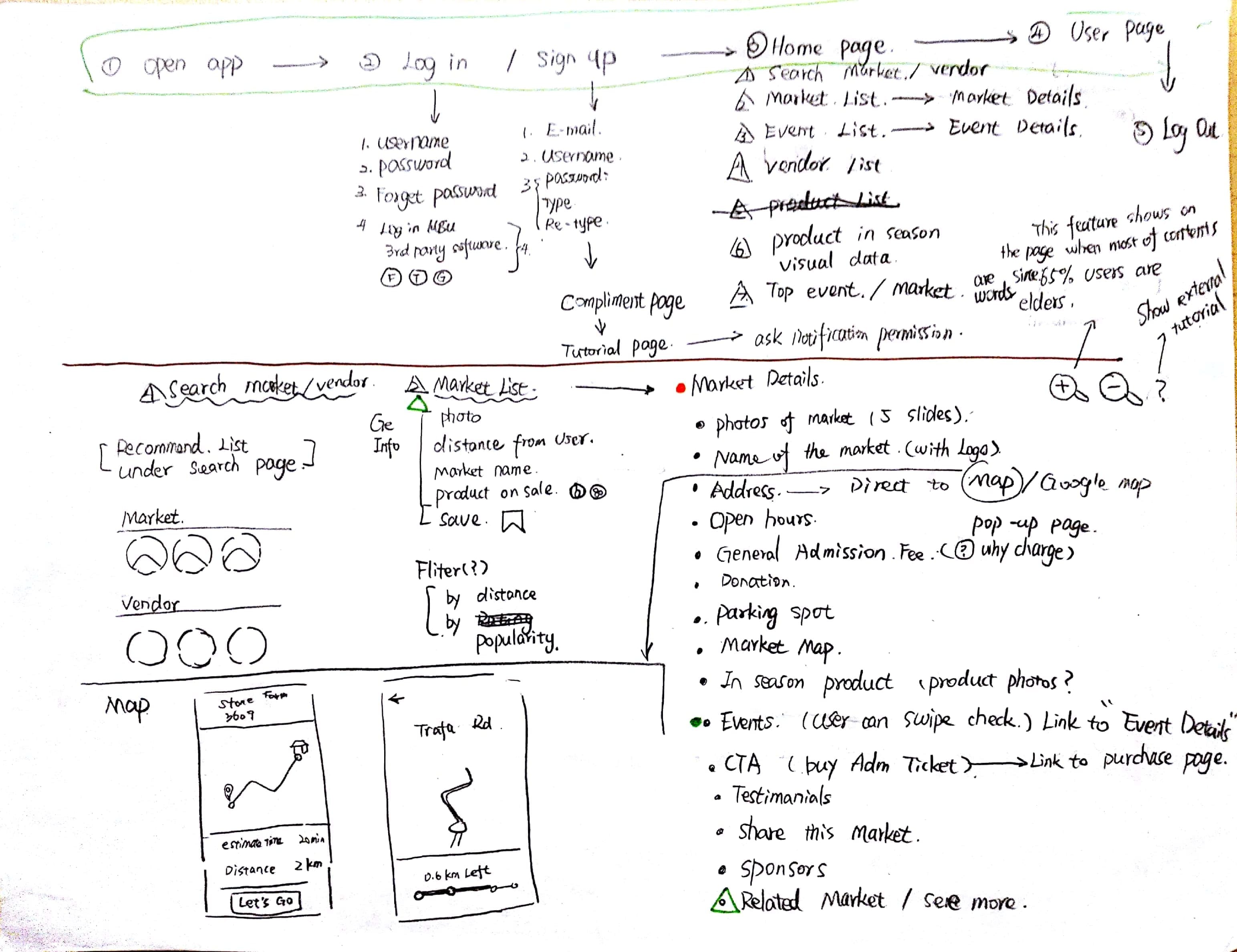
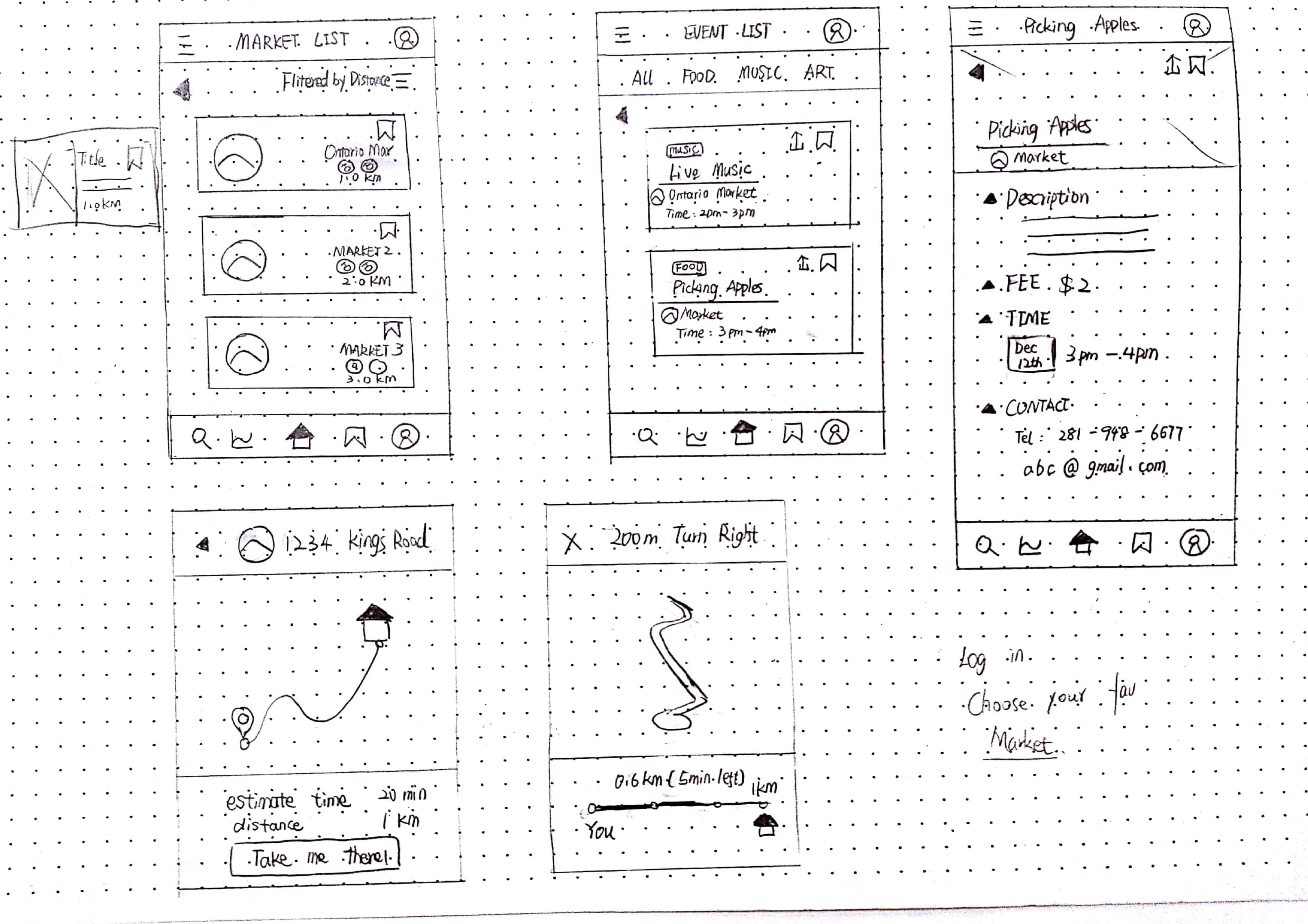
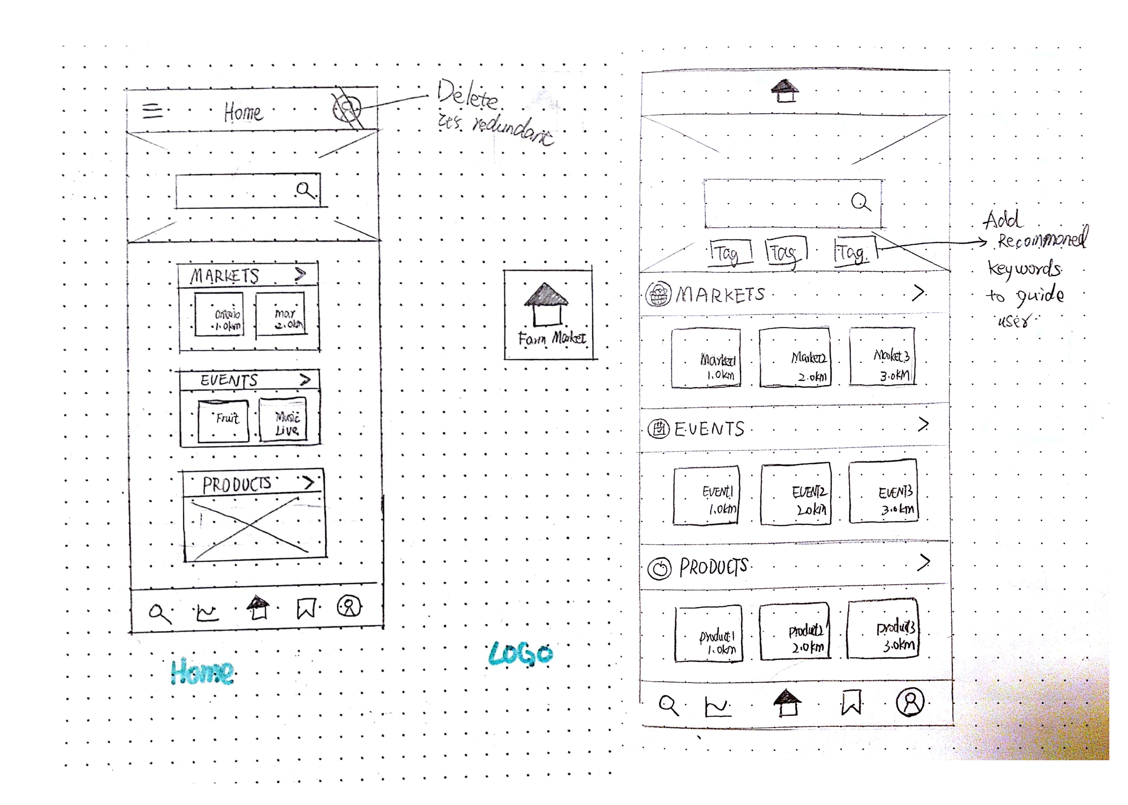
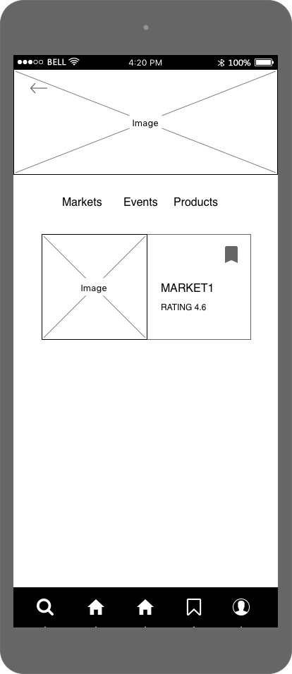
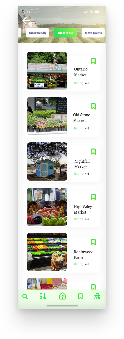
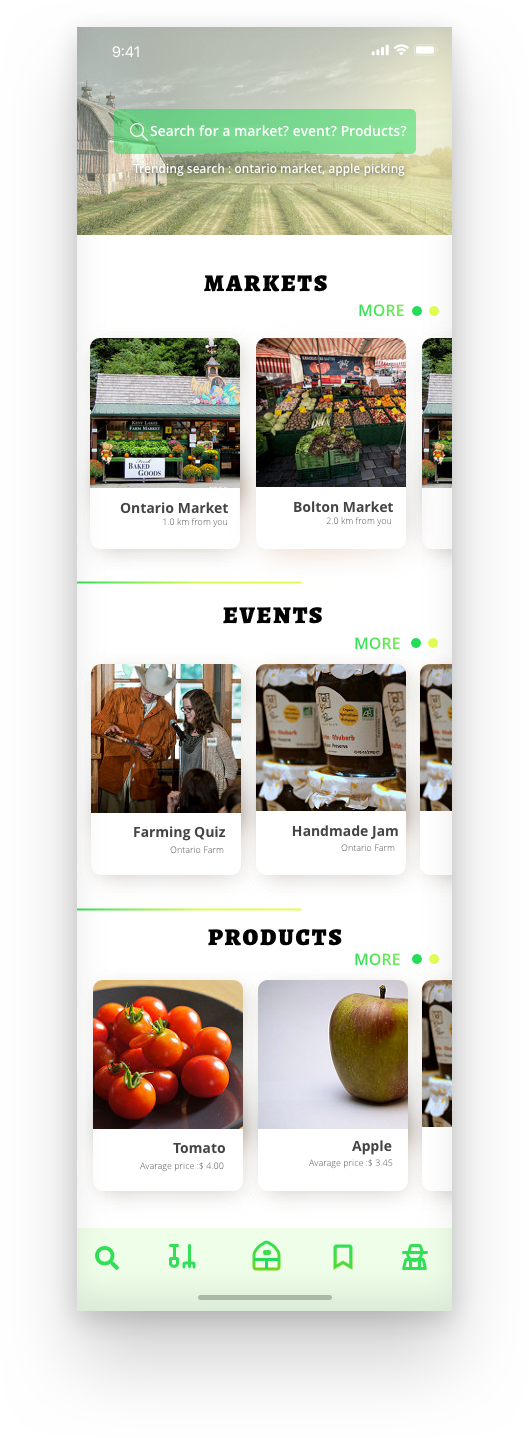
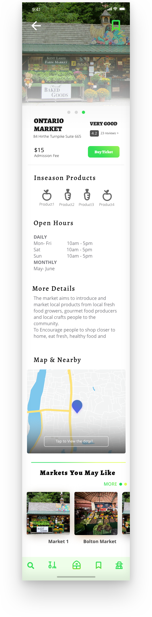
1. Minimize the clicking. Let user easy to find the information by only use few clicks.

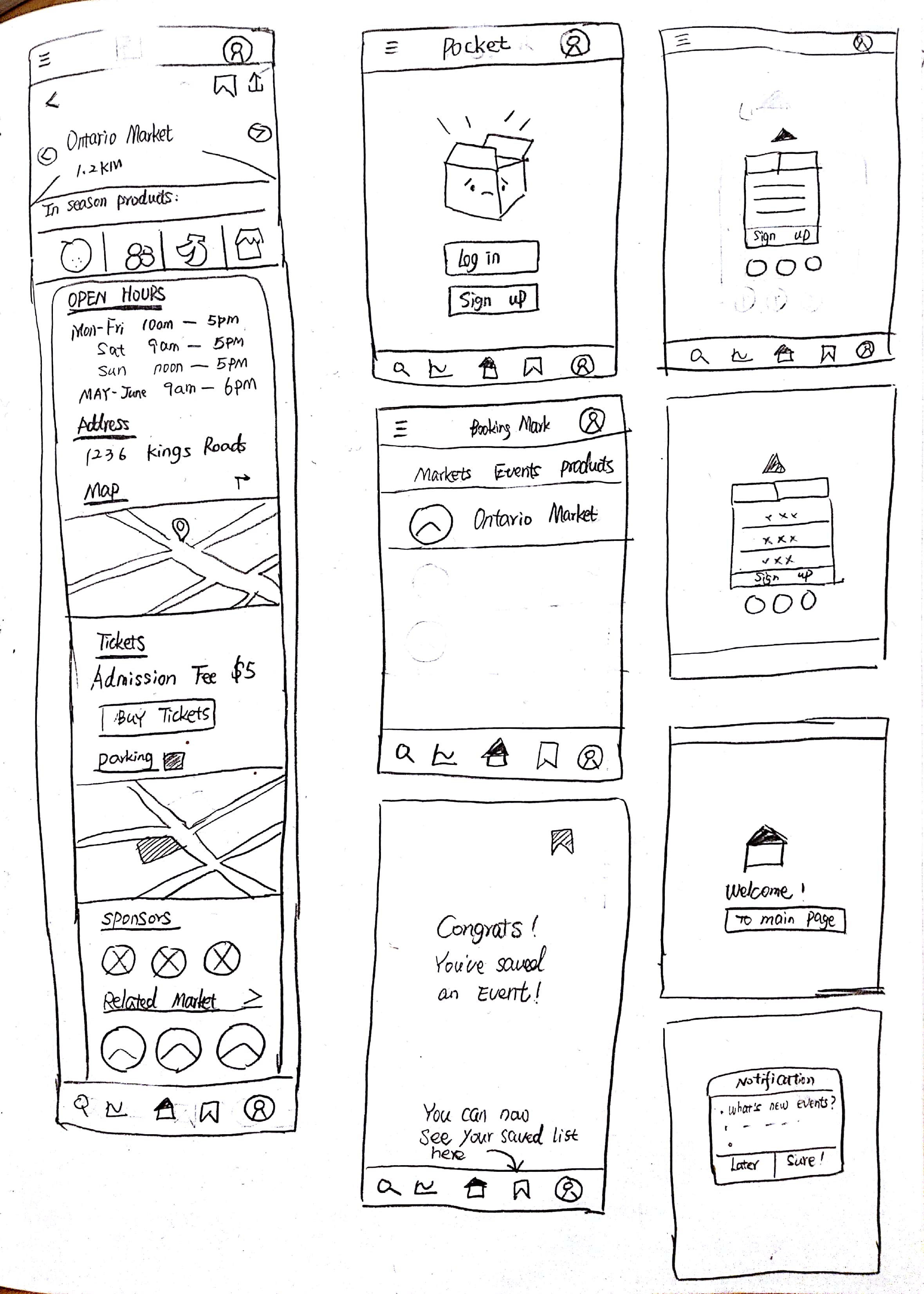
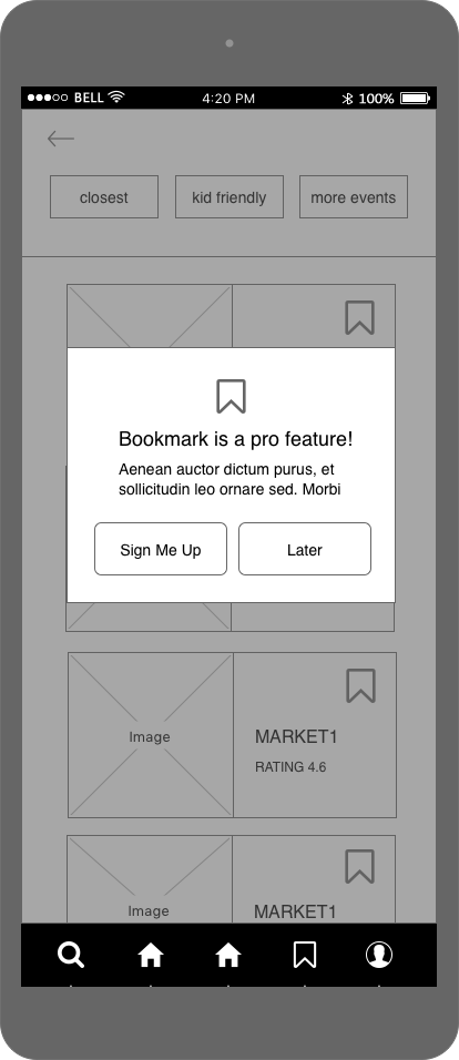
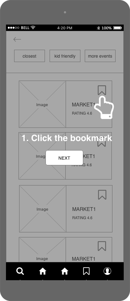
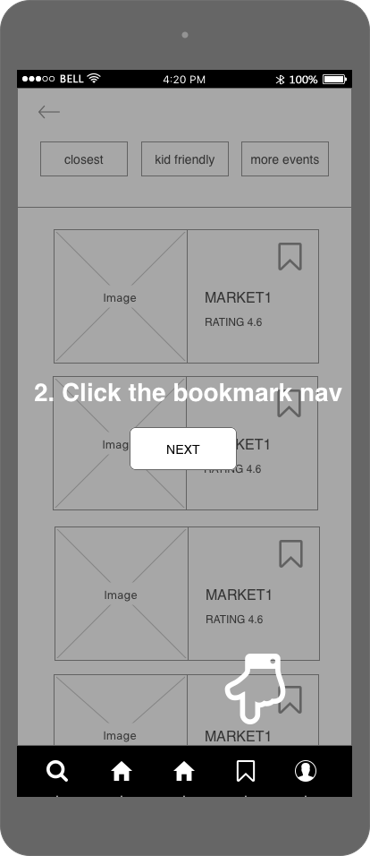
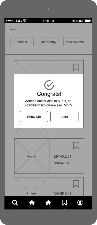
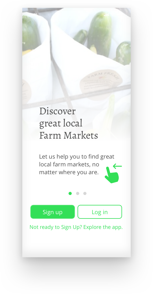
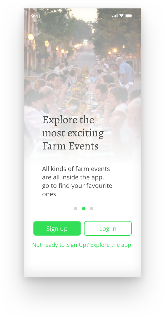
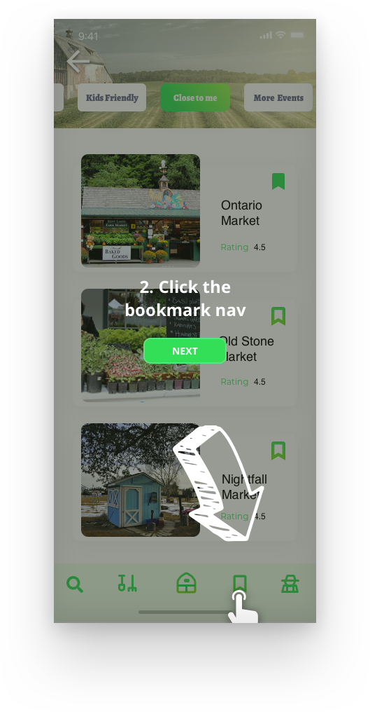
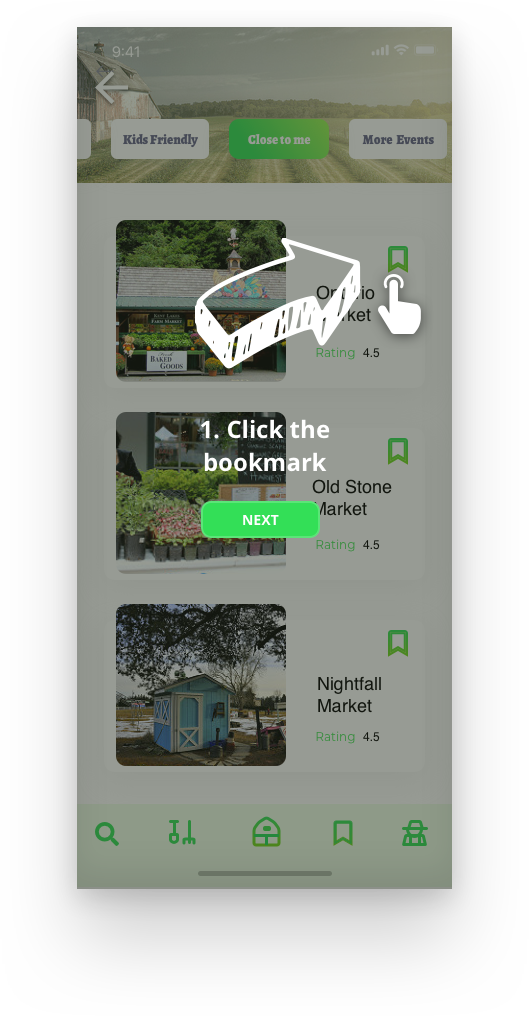
2. Don't force user to sign up or log in when they just download the app. Set some pro features to let user decide after they've been spending time on the app. For my design, I decided to add one bookmark feature. When user want to save their favourite market or event, a notification will pop up and suggest user to log in to get this pro feature.

3. Categories features into 3 main parts: markets, events, and products. Use proper typography to make each paragraph clean.

Information Architect

I made this site map to define the basic flow of my app.

Then I list all the contents that may apprear in the app before diving in the actual design.

Prototype

Low Fidelity

Medium Fidelity

Iteration

Home Page

In the original home page, the main list layout was narrow, and each of list has 2 thumbnail screens. For the sake of user's eyesight, I decided to expand the width on the main list.

Scenario

I wrote two scenarios for my potential users, even though they all made up stories, but it helped me fully understand the situation when a user may use a specific feature.

Wireframe

Based on the scenario, I designed a series of wireframe which includes the main features I want to demonstrate.

Style Tile

Mockup Design

What I've learnt from this project

1. With the help of user research, product can be designed more human-centered。

2. A nice well designed product must have been iterated for few times.